untangling tennis

A visual and data analytic exploration of success in tennis: Uncovering the relationship between performance and popularity.

The life of a professional athlete is not a smooth ride, it is full of ups and downs, life-changing victories and crushing defeats, serious injuries and awe-inspiring recovery. It is also glamorous, athletes are cherished, admired and often criticized as celebrities. Succeeding in the world of tennis means both excelling in the game and being popular enough to attract good endorsement deals. Here we delve deep into how success is achieved, both performance and popularity-wise and how those two relate to each other.

Explore the Visualization

Read the Paper


Share video:

Twitter - Facebook - Vimeo

Data

The data behind this project consist out of two main parts. Performance data from Tennis players as well as their Wikipedia page-views.

Performance

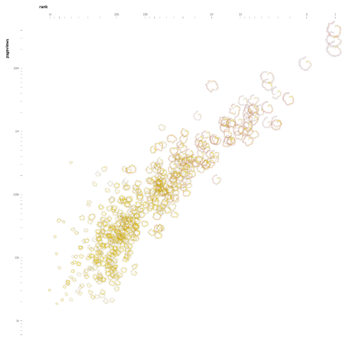
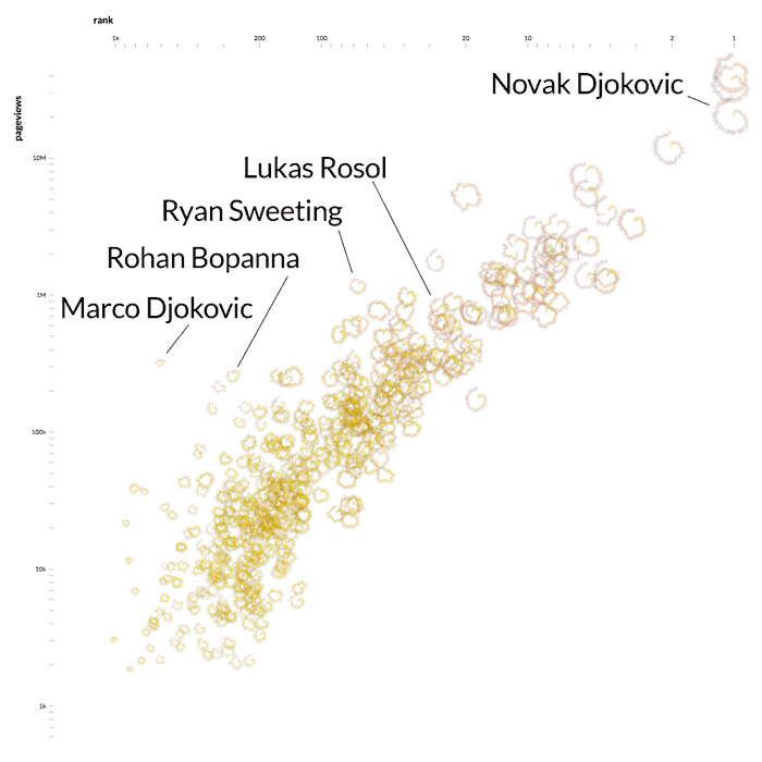
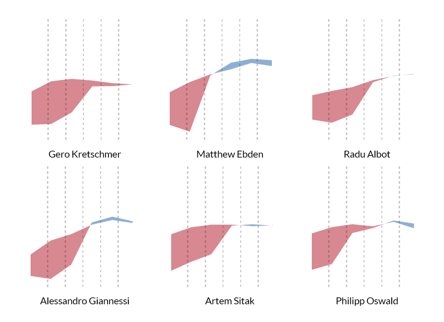
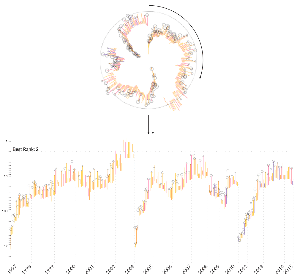
We started with all players from the Association of Tennis Professionals who were active any time between the years 2009 and 2015. For those, we recorded all of their career performance data, including their weekly place in the rankings, the dates and names of all the tournaments they attended, how many score points those tournaments were worth, how many matches they played in those, against whom and what the result was.

Responsive image

Popularity

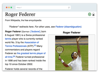
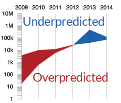
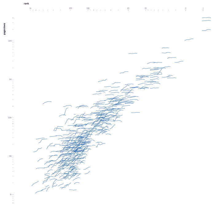
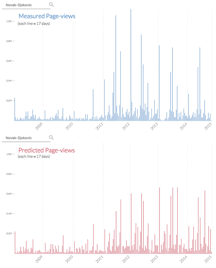
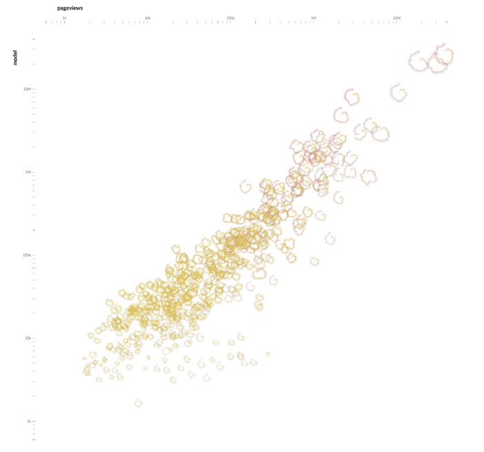
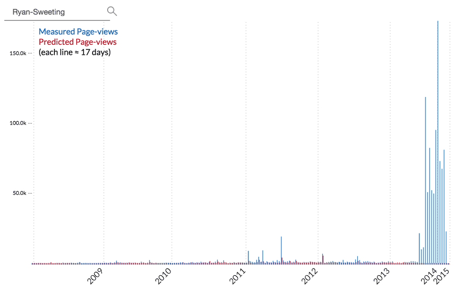
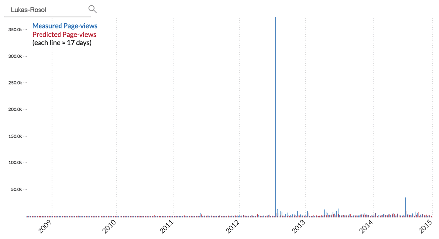
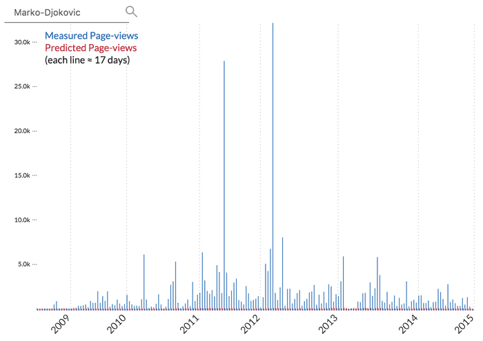
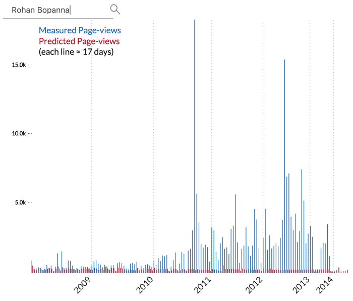
From those players we selected the ones who were famous enough to have their own Wikipedia page at any time during the same period. After eliminating those sharing a name with some other famous person to avoid confusion, we ended up with about 500 players. As a proxy for how popular those players were, we used the number of page-views of their Wikipedia articles. We collected all instances someone clicked on those pages and aggregated them for periods of approximately 17 days to see if the ebbs and flows of activity would match the tournaments.

Responsive image

Model

We created a mathematical model to predict the Wikipedia page-views, using only the performance data. Here is how we used several markers of performance for visualizing player careers as well as building the model:

Tool

In the interactive Visualization we can first look at how different parameters relate to each other for all players. For that, we used three different icons for each player, each carrying information about the three main parts of the data:

Performance

Rolled up icons of player careers, showcasing the five performance parameters.

data visualization tennis sport

Popularity

Lines charts of the total number of people looking at player Wikipedia pages each year.

data visualization tennis sport

Prediction

A comparison between the yearly measured page-views and those predicted by the model.

data visualization tennis sport

In the scatterplots below we see how the total number of page-views a player's Wikipedia article receives is related to the best rank he achieves during that time, using the three different icons. Using the interactive tool, you can see all other possible relations as well.

data visualization tennis sport

Now we can also take a closer look at individual player careers, in terms of both their performance and their popularity. Clicking on each player icon reveals the following:

Performance

The performance history of a player in terms of all the tournaments he attended, showcasing the five factors described in the model section.

data visualization tennis sport

Popularity and Prediction

A more granular comparison between the measured popularity and the one predicted relying only on performance data.

data visualization tennis sport

Explore the Visualization

Findings

Across the board we see clearly that a tennis player attracts public attention first and foremost by playing well on the court. Top performers need nothing else but to go out there and play, people follow them for doing what they do best.

For the less accomplished players, other events may gain them short-lived bursts of popularity: Sometimes these happen on the court, they win a juniors top rating, or break a record, but sometimes they get attention just for associating with a (more popular) celebrity.

data visualization tennis sport

Performance explains popularity

This is a comparison between the total measured and model-predicted page-views of all players. Here we can see that for most players, but especially the top ones, the performance based model explains the popularity very well.

data visualization tennis sport

Outliers

As in anything, there are exceptions though. Some players seem to be much more popular than what their performance indicates. Here we see a few examples of players whose fame supersedes those of the same best rank.

data visualization tennis sport

Ryan Sweeting

He is another example of fame gained by other means, unrelated to the courts. He got married to (and later divorced from) the famous actress Kaley Couco, this association causing a lot of people to look him up on Wikipedia. Hence the unexpected burst in his popularity in mid-2013.

data visualization tennis sport

Lukas Rosol

Not all outliers are caused by events unrelated to performance. Lucas Rosol is one such example: He had an extraordinary event on the court; he defeated the then World No. 2 Rafael Nadal in the second round of Wimbledon to achieve one of the biggest wins in his career. This victory against all odds gave him a burst of popularity but his '15 minute of fame' was indeed short-lived.

data visualization tennis sport

Marco Djokovic

This player shares the same last name with a more accomplished, well-loved player, Novak Djokovic. Actually, Marco is Novak's little brother. For that reason, it seems like people pay much more attention to him than it would be expected from his accomplishments on the court.

data visualization tennis sport

Rohan Bopanna

Another example of performance factors not accounted for in our model are tournaments outside of the scope of the ATP World Tour or doubles matches. Here we see such a player, who had minor accomplishments in singles but made a career in doubles achieving World No. 3 ranking there.

data visualization tennis sport

Wikipedia catching up late

The interactive tool allows us to discover other anomalies, such as these players whose popularity seem to be overestimated by our model for years until the actual page-view numbers caught up. We discovered that these mismatches were caused by unstable Wikipedia pages, getting constantly edited into and out of existence until they are finally accepted as legitimate additions.

data visualization tennis sport

Outstanding careers

Sometimes player careers undergo drastic changes which are already discoverable through performance icons. Periods of injury and recovery are among such features. We see here that Tommy Haas, for example, has managed to recover from several serious injuries, each time bouncing back to his previous performance levels even after prolonged absence from the field.

These are just a few of the many interesting phenomena that can be discovered about the life and career of a professional tennis player (unfortunately, the data is limited to men's tennis for now) using our visualizations. Feel free to play with it, discover your own findings and let us know what you think!

Team

Burcu Yucesoy

Theory
& analysis

data visualization tennis sport Burcu Yucesoy google scholar
@Karhe

Kim Albrecht

Creative direction
& data visualization

data visualization tennis sport Kim Albrecht kimalbrecht.com
@kimay

Albert-László Barabási

Project
coordinator

data visualization tennis sport Laszlo Barabasi barabasi.com
@barabasi